- Introduction
- Candela
- Datawrapper
- Google Data Studio
- Google Charts
- Leaflet
- MyHeatMap
- Palladio
- RawGraphs
- Tableau
- Timeline
- Chartist.js
- ColorBrewer
- D3.js
- Plotly
- Polymaps
- GanttPro
- Qlik
- SAS Visual Analytics
- Chart.js
- Summary
- References
Introduction
Data visualization is to use tools to create statistical charts, plots, graphics or tables to present data visually. The goal of data visualization is to present data to audience clearly and efficiently. It makes complex data easier to be accessible and understandable.
Data visualization is an important part for data analysis including raw data exploration and results presentation.
Common representation usages:
| Type of information | Type of chart |
|---|---|
| Components | Pie chart |
| Item | Bar chart |
| Time Series | Line chart |
| Frequency | Line chart, Histogram |
| Correlation | Scatter plot, side-by-side bar chart |
Here are some tools for data visualization.
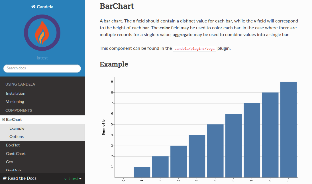
Candela
Candela is an open-source suite of inter-operable web visualization components. It provides library for JavaScript, package for Python and R.
Installation
For JavaScript,
npm install candela
Then the js file can be found at node_modules/candela/dist/candela[.min].js.
For Python,
pip install pycandela
For R, to install directly from GitHub:
install.packages('devtools')
devtools::install_github('Kitware/candela', subdir='R/candela', dependencies = TRUE)
to install from a Git checkout:
setwd('/path/to/candela/R/candela')
install.packages('devtools')
devtools::install(dependencies = TRUE)
devtools::check()
Components
Components list:
- BarChart
- BoxPlot
- GanttChart
- Geo
- GeoDots
- GLO (Graph-Level Operations)
- Histogram
- LineChart
- LineUp
- OnSet
- ScatterPlot
- ScatterPlotMatrix
- SentenTree
- SimilarityGraph
- TreeHeatmap
- UpSet
Datawrapper
Datawrapper is a on-line data visualization tool. Users can create charts, reports and maps on-line easily. The free version allows a single user to create 10,000 chart views and 1 locator maps per month. It also works on mobile, tablet and desktop devices.
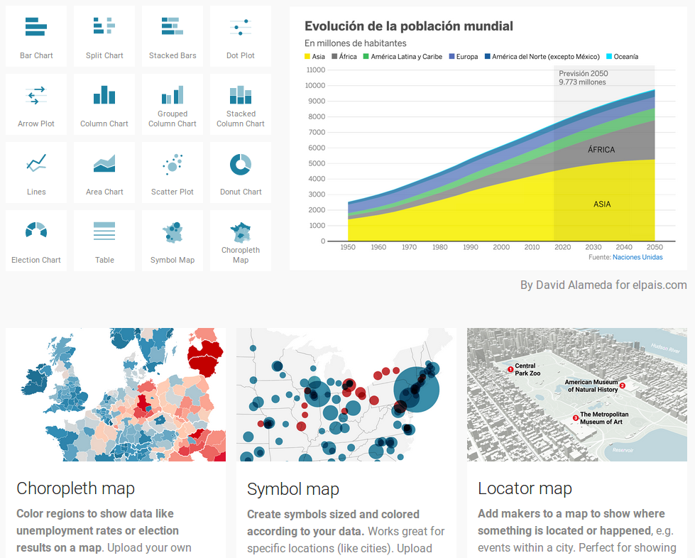
Charts and Maps:
- Bar charts: normal bar chart, stacked bar chart, bullet bar chart, split bar chart, grouped bar chart, population pyramid.
- Column charts: normal column chart, grouped column chart, stacked column chart.
- Line charts: normal line chart, slope chart.
- Area chart: normal, pie chart, donut chart.
- Tables: short table, long table.
- Scatter plots.
- Dot charts: dot plot, range plot, arrow plot.
- Maps: symbol map, choropleth map.
- Locator maps.
Google Data Studio
Google Data Studio is also a web data visualization tool. You only need a Google account to sign up and can connect it with other Google products such as Google Analytics and Google Sheets for data sources.
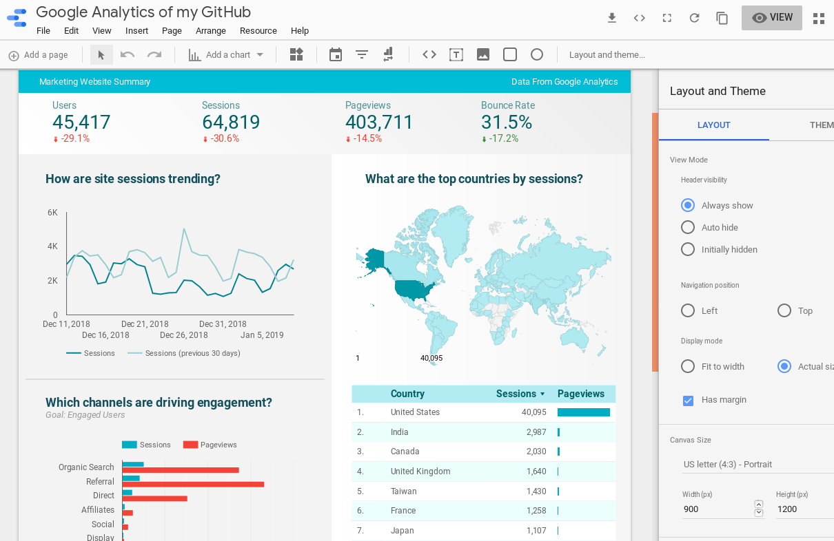
Google Data Studio provides tools to easily create detailed reports including descriptions, tables and charts.
Charts and Maps:
- Table
- Scorecard
- Time series
- Bar
- Pie
- Goe map
- Line
- Area
- Scatter
- Pivot table
- Bullet
Google Charts
Google Charts provides free and simple tools for interactive charts and data visualization.
The most common way to use Google Charts is with to embed simple JavaScript in web page. Load some Google Chart libraries, list the data to be charted, select options to customize chart, and finally create a chart object with an id. Then, later in the web page, create a <div> with that id to display the Google Chart.
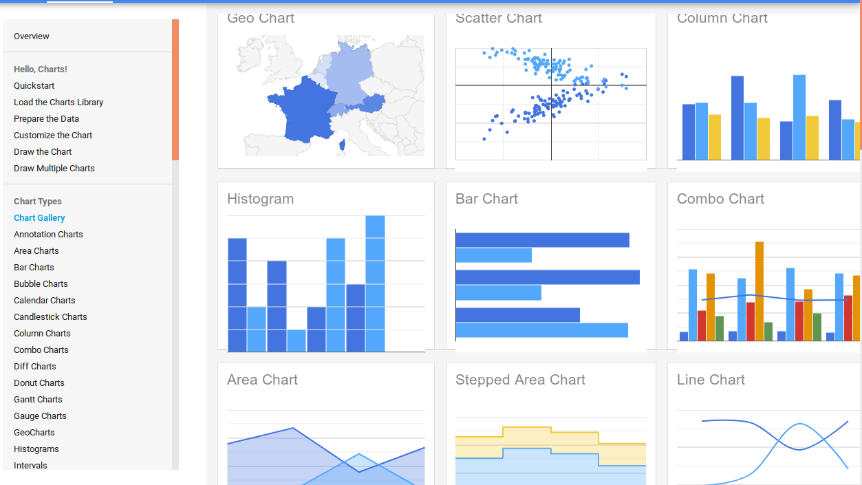
Charts:
- Geo Chart
- Scatter Chart
- Column Chart
- Histogram
- Bar Chart
- Combo Chart
- Area Chart
- Stepped Area Chart
- Line Chart
- Pie Chart
- Bubble Chart
- Donut Chart
- Org Chart
- Treemap
- Table
- Timeline
- Gauge
- Candlestick Chart
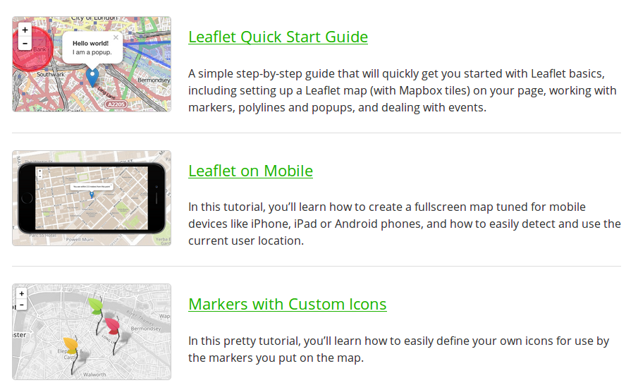
Leaflet
Leaflet is an open-source JavaScript library for mobile-friendly interactive maps. It has lots of mapping features and can be extended with lots of plugins.
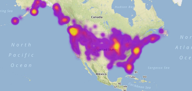
MyHeatMap
MyHeatMap is a free web tool to create interactive heat maps by uploading a CSV file with data. It is a simple tool to view geographic data interactively.
But the limitation is that, the free version only allows to create maps with 20 data points for each.
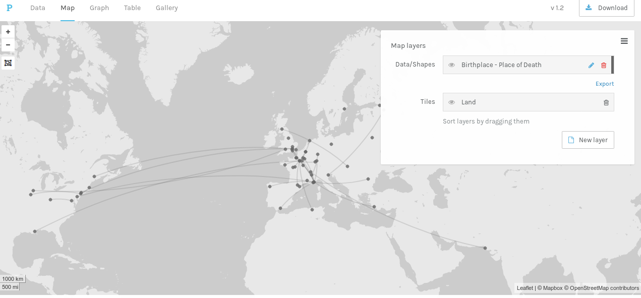
Palladio
Palladio can visualize complex historical data with ease. Its data visualization views include Map view, Graph view, Table view and Gallery view.
- Upload data from spreadsheet, tabular(.csv, .tab, .tsv) or a public Dropbox file.
- In Map view, coordinates data can be seen as points on a map. Relationships between distinct points can be connected by lines.
- In Graph view, relationships can be visualized between any two dimensions of data. Information will be displayed as nodes connected by lines.
- In Table(List) view, dimensions of data can be arranged to make customized lists.
- In Gallery view, data can be displayed within a grid setting for quick reference.
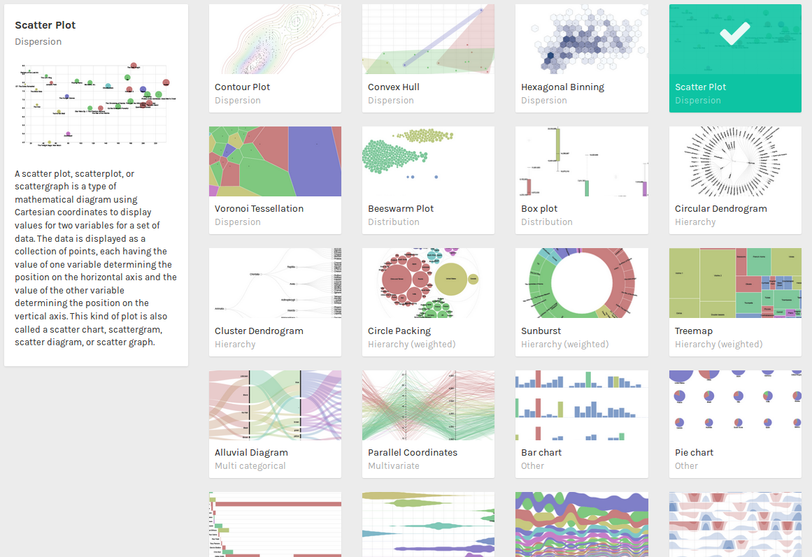
RawGraphs
RawGraphs is an open source web tool to create custom vector-based visualizations on top of d4.js library. RawGraphs is also highly customizable and extensible, accepting new custom charts defined by users.
The process:
- Upload data with delimiter-separated values (i.e. csv and tsv files) or copied-and-pasted texts from other applications (e.g. Microsoft Excel, Google Spreadsheets, TextEdit).
- Choose a chart from those visual models.
- Customize visualization after mapping data dimensions.
- Export visualizations as vector (SVG) or raster (PNG) images.
Charts:
- Contour Plot.
- Convex Hull.
- Hexagonal Binning.
- Scatter Plot.
- Voronoi Tessellation.
- Beeswarm Plot.
- Box Plot.
- Circular Dendrogram.
- Cluster Dendrogram.
- Circle Packing.
- Sunburst.
- Treemap.
- Alluvial Diagram.
- Parallel Coordinates.
- Bar Chart.
- Pie Chart.
- Gantt Chart.
- Area Graph.
- Bump Chart.
- Horizon Graph.
- Streamgraph.
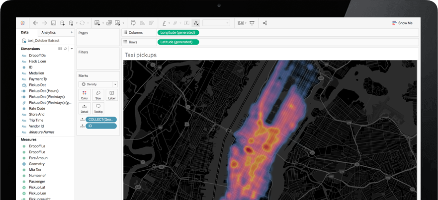
Tableau
Tableau is a famous business intelligence tool. It contains several products including Tableau Desktop, Tableau Prep, Tableau Online and Tableau Server. It is a powerful, secure, and flexible end-to-end analysis platform.
Tableau Commercial
Tableau Prep is the tool to prepare the data for analysis. It contains two products: Tableau Prep Builder for building data flows and Tableau Prep Conductor for sharing flows and managing. The builder is used mainly for combining, shaping and cleaning data. The data source could be Amazon Aurora, Google Cloud SQL, IBM DB2, Microsoft products, MongoDB, MySQL, Oracle, PostgreSQL, SAP Sybase, Teradata, Text file.
Tableau Desktop is the main tool to build the analytics locally by connecting to varying data sources, dragging-and-dropping visually to create diagrams. It could connect to more data sources: Amazon, Google, SAP, Dropbox, IBM DB2, JSON files, KML files, MariaDB, Microsoft products, Microsoft Azure, MongoDB, MySQL OData, Oracle, PostgreSQL, R files, SPSS files, Teradata, text files, Web data connector.
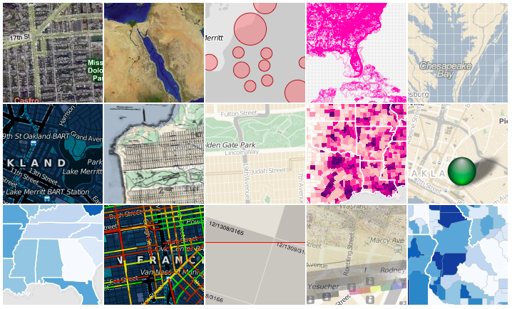
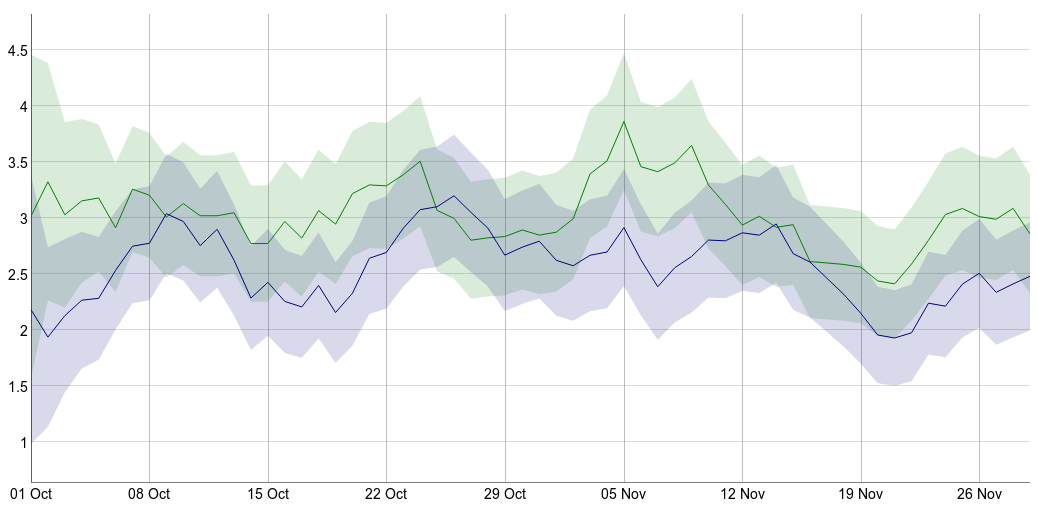
Tableau Online and server is used to share data and insights. User could try Tableau Online directly on the web. Tableau Online could connect to cloud databases like Amazon Redshift and Google BigQuery and automatically refresh data.
The image below shows the an example on Tableau Online.
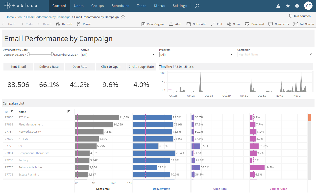
Tableau Public
Tableau Public is a free version of Tableau with 10 GB of storage. With it, users can also create and share interactive charts, graphs and maps. The data source could be Excel, text files, Google Sheets, web data connectors, spatial files. It is also quite powerful.
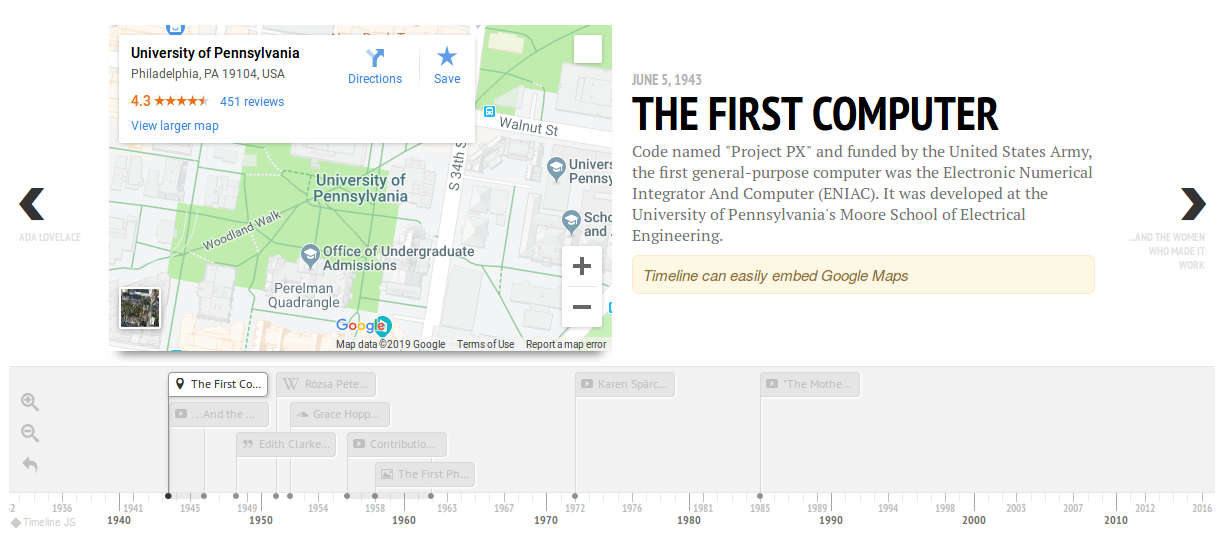
Timeline
Timeline is an open-source web tool to create visually rich, interactive timelines. Use a Google Drive spreadsheet to create a timeline from the template. Use JSON skills to create custom installations.
Chartist.js
Chartist.js is a simple and lightweight library built with SVG to create responsive charts on website.
Chartist.js offers great flexibility and is customizable. Specifying the style of chart in CSS is not only cleaner but also enables to use awesome CSS animations and transitions to be applied to SVG elements. It has even added a simple but powerful animation API that allows to create SMIL animations in a more convenient way.
Chart types:
- Line Chart.
- Bar Chart.
- Pie Chart.
ColorBrewer
ColorBrewer is a free tool that can be used to make maps better in terms of color schemes. The tool makes it easy to differentiate colors on a complex map.
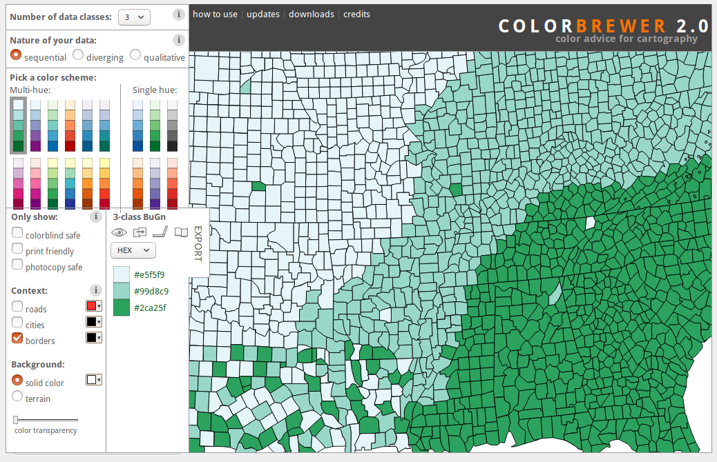
The version 1.0 is based on Flash. And the version 2.0 is based on JavaScript and CSS.
D3.js
D3.js (Data-Driven Documents) is an JavaScript libarry for visualizing data using web standards. D3 allows to bind arbitrary data to a Document Object Model (DOM) with SVG, Canvas and HTML, and then apply data-driven transformations to the document. D3 API contains several hundred functions.
Plotly
Plotly offers the fastest growing open-source visualization libraries for R, Python and JavaScript. Its products include Dash, Chart Studio and Plotly.js.
Dash is a Python framework for building analytical web applications without requirements of JavaScript. It is built on Plotly.js, React and Flask. Dash is lightweight and provides a simple interface for UI controls.
Chart Studio is used to create and edit D3.js and WebGL charts online. Users can make D3 and WebGLcharts entirely without code by uploading a CSV file or connect to a SQL database through Falcon.
Plotly.js is a high-level, declarative charting library, built on top of d3.js and stack.gl. plotly.js ships with 20 chart types, including 3D charts, statistical graphs, and SVG maps.
Polymaps
Polymaps is a JavaScript library for image- and vector-tiled maps using SVG. Polymaps provides speedy display of multi-zoom datasets over maps, and supports a variety of visual presentations for tiled vector data, in addition to the usual cartography from OpenStreetMap, CloudMade, Bing, and other providers of image-based web maps.
Dygraphs
Dygraphs is a fast, flexible open source JavaScript charting library. It allows to explore and interpret dense data sets. This tool is highly customizable and offers strong support for error bars / confidence intervals.
GanttPro
GanttPro is a project management tool to create online gantt charts to plan project and manage tasks.
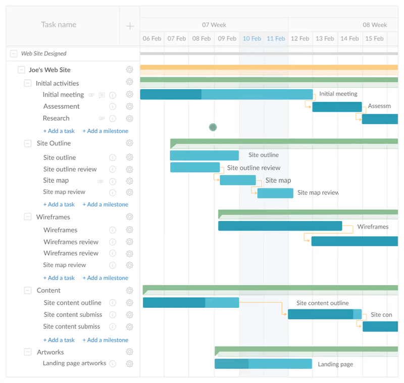
But it is not a free tool. Users can only get a 15-days trial.
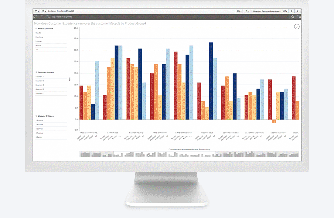
Qlik
Qlik is a powerful BI tools platform. It provides several products:
- Qlik Sense: a multi-cloud solution for modern BI.
- Qlik Analytics Platform: used for embedded and custom analytics.
- Qlik View: used to build and deploy interactive, guided analytics applications.
- Qlik Core: a native cloud analytics development platform.
- Qlik Data Catalyst: used to deliver analytics-ready data for enterprise.
- Qlik GeoAnalytics: used for location-based analytics.
Among these tools, QlikView and Qlik Sense are the two main products. Qlik Softwares for enterprises are not free. But Qlik Sense cloud basic, Qlik Sense desktop version and QlikView personal edition are free for users to try.
QlikView
QlikView is for guided analytics. It allows users to rapidly build and deploy analytic applications and is used for day-to-day tasks, analyzing data with a slightly configurable dashboard.
Qlik Sense
Qlik Sense is for self-service, guided, embedded visualization and reporting. It allows associating different data sources and fully configuring the visualizations, allowing to follow an individual discovery path through the data.
SAS Visual Analytics
SAS Visual Analytics is a BI tool for data exploration, data visualization and prediction with its highly visual, drag-and-drop data interface.
SAS Visual Analytics can be used for self-service data preparation, data visualizations, reporting, self-service analytics, text analysis and location analytics.
Analytical visualizations include:
- Box plots.
- Heat maps.
- Animated bubble charts.
- Network diagrams.
- Correlation matrices.
- Line charts with forecasting.
- Parallel coordinates plots.
- Donut charts.
- Decision trees.
- And more.
SAS Visual Analytics even offers Apps for mobile devices.
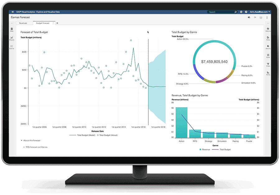
Chart.js
Chart.js is an open source JavaScript library to create simple, clean and engaging HTML5-based charts with several chart types and animation. It also provides some APIs for developers to extend and enhance the library.
Chart types:
- Bar charts: vertical, horizontal, stacked, stacked groups, multi axis.
- Line charts: basic, multi axis, stepped, interpolation, line styles, point styles, point size.
- Area charts: boundaries, datasets, stacked, radar.
- Scatter.
- Pie chart.
- Bubble Chart
Summary
Personally, I will recommend:
- Python: Candela, Plotly,
- JavaScript: Google Charts, D3.js.
- Others: Google Data Studio, Tableau, Qlik
References
- 20 Free and Open-Source Data Visualization Tools
- Top 5 Data Visualization Tools for every Data Scientist
- Candela
- Datawrapper
- Google Data Studio
- Google Charts
- Leaflet
- MyHeatMap
- Palladio
- RawGraphs
- Tableau
- Tableau Public
- Timeline
- Chartist.js
- ColorBrewer
- D3.js
- Plotly
- Polymaps
- Dygraphs
- GanttPro
- Qlik
- QlikView
- Qlik Sense
- SAS Visual Analytics
- Chart.js
blog comments powered by Disqus